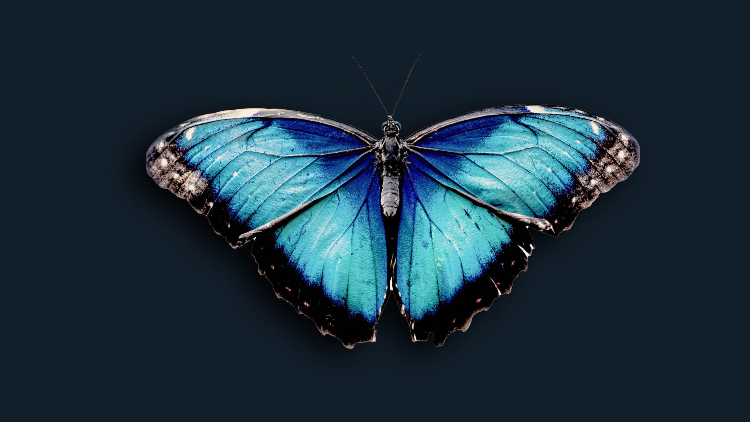
In 1999 Pantone named the sky blue Cerulean as the colour of the new millennium.
Pantone selected the colour Blue Iris as the 2008 Colour of the Year telling us: “Combining the stable and calming aspects of blue with the mystical and spiritual qualities of purple, Blue Iris satisfies the need for reassurance in a complex world, while adding a hint of mystery and excitement.”
Blue is first and foremost a calming colour, one that promotes physical and mental relaxation, inner security and confidence. Colour therapy uses blue to stimulate healing, relieve pain and lower blood pressure. Blue is linked to integrity, honesty, loyalty, kindness, commitment and endurance. It benefits the throat, thyroid, parathyroid, lungs and mouth.
People who wear light blue clothing are often creative, sensitive and imaginative. They need a peaceful environment. Darker blue conveys importance and confidence without being somber or sinister, hence the power suit of the corporate world and the uniforms of many police officers. Long considered a corporate colour, blue, especially medium and darker shades, is associated with intelligence, stability, unity and conservatism. Combine a light and dark blue to convey trust and truthfulness — banker’s colours.
Because light blue promotes creativity it is recommended for decorating offices and studies. Feng shui advocates using blue as a ceiling colour, as several studies have shown that children perform better under a blue-coloured ceiling than under white.
Dark blue is a welcome addition to the bedroom as it encourages deep and peaceful sleep. Be careful however not to use it in a room where you plan to spend your days, as the powerful sedative effects might prove unproductive.
Ideally, blue should be associated with yellow, which stimulates the mind and raises one’s organisational capacity. Turquoise seems to facilitate communications between people who surround themselves in it.
Blue is probably the most popular colour in logo design. While in advertising blue is often used to promote products and services related to cleanliness (water purification filters, cleaning liquids, vodka), air and sky (airlines, airports, air conditioners), water and sea (sea voyages, mineral water). As opposed to emotionally warm colours like red, orange and yellow; blue is linked to consciousness and intellect. This is why blue is used to suggest precision when promoting high-tech products.
It’s advised to not use blue in association with anything food or cooking related, as it suppresses the appetite. Blue, when combined with warm colours like yellow or red, can create high impact and vibrant designs. It is often considered to be the safest global colour.
Michael Quinn of The Blue Man Group wrote about the choice of blue:
“Blue just felt right on all counts. All other colours had some sort of connotation that we didn’t want. Green was alien or Martian and it represents envy. Red is angry or has socio-political connections. Black and white have racial connotations. Yellow is jaundiced and sickly. Blue was perfect. It represents serenity, calmness. It represents water, the stuff of life. It is neutral, vibrant and simple.”
During the Middle Ages, lapis-lazuli, the blue pigment of choice of illuminators, was so precious that it cost as much if not more than gold. That is the reason blue was used to depict the Virgin’s mantle. While in antique Greece and Rome, sky blue was the colour of Zeus and Jupiter. Today, in Iran, blue is the colour of mourning while in the West the something blue bridal tradition represents love.

