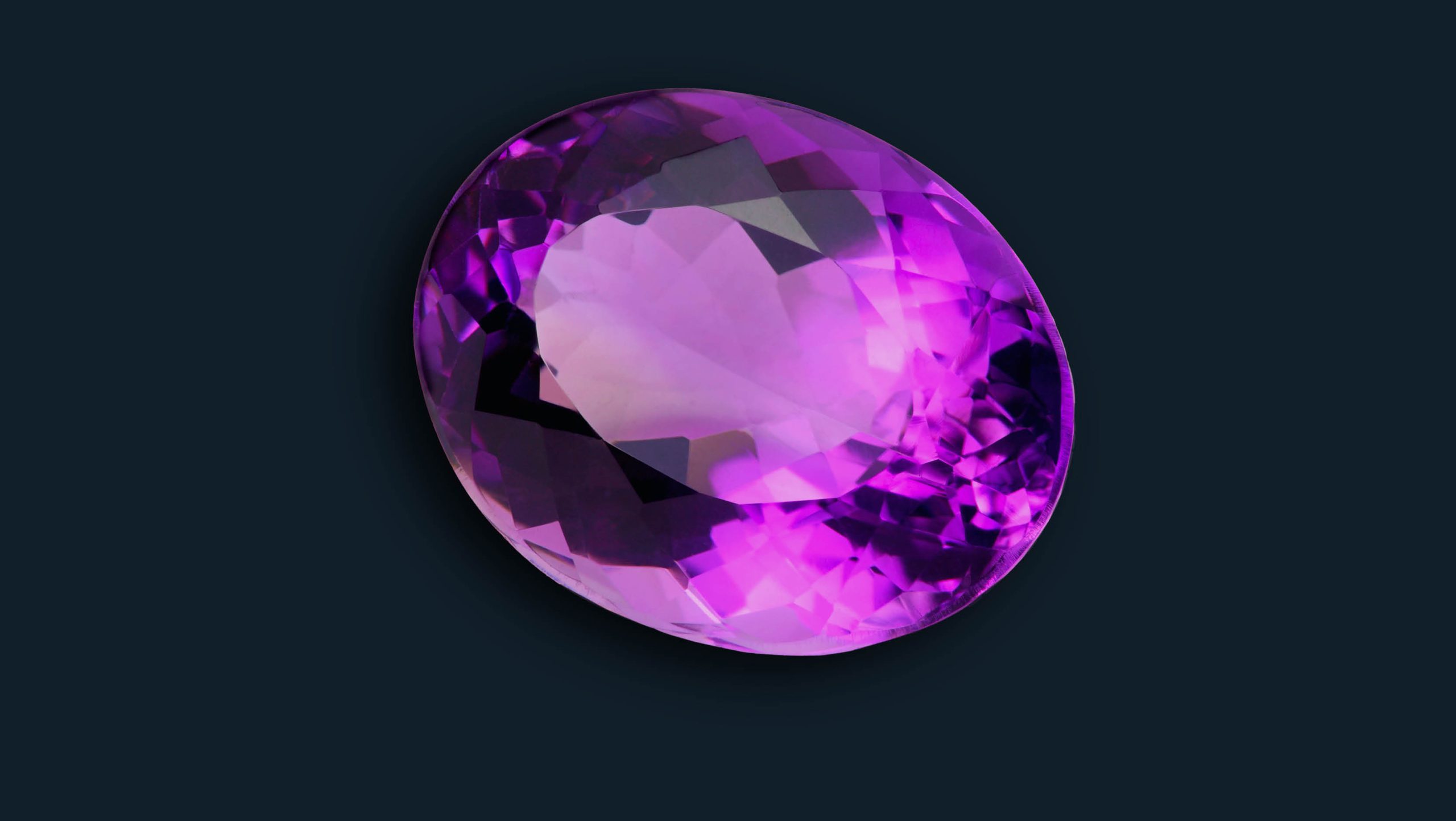
Violet combines the stability of blue and the energy of red.
Violet is associated with royalty. It symbolises power, nobility, luxury and ambition. It conveys wealth and extravagance. Violet is associated with wisdom, dignity, independence, creativity, mystery and magic.
According to surveys, almost 75 percent of pre-adolescent children prefer violet to all other colours. Violet is a very rare colour in nature; because of this some people consider it to be artificial. It is advisable therefore to not use violet in designs trying to portray a sense of “natural”. Light violet is a good choice for a feminine design. While bright violet can be used for promoting children’s products. Lighter coloured violets tend to evoke romantic and nostalgic feelings while darker violets more commonly convey gloom, sad feelings and frustration.
Because violet is the combination of red and blue, it has both warm and cool properties. It aids concentration, insight and imagination and promotes peace of mind. Physically it benefits the pituitary gland, left eye, sinus, nose and eyesight. The colour violet can be found in many education related and luxury product logos.
The Hallmark company used the slogan “When you care enough to send the very best.” The use of the colour violet in the logo supports the marketing message of the company. It implies royalty, expense and sophistication which is reinforced by the crown icon that hovers over the type.
Violet is thought to be antiseptic. In some operating rooms, ultraviolet rays are used to purify the air. In psychiatry, violet is used to treat patients who suffer from fears and obsessions because of its calming effects.
According to psychologists, violet contributes to mental equilibrium. In addition, it is associated with a sense of the artistic, music, intuition and spirituality. It promotes sensitivity and compassion.
People who wear violet are described as very sensitive and charitable. Their sensitive nature could make them vulnerable; that is why they are often advised to wear magenta, which contains red, to improve their self-confidence.
In home decorating, violet is sometimes used to create theatrical environments that reflect the creative personality of the residents. Artists often like to have a touch of violet in their studios. Violet also lends itself to rooms that are earmarked for prayer and meditation.
One of the most iconic design uses of the colour purple is undoubtably the Cadbury brand. For 100 years Cadbury had used the colour purple for its leading brand, the smooth velvety Dairy Milk; helping to convey wealth, intelligence and sophistication. To safeguard this luxurious image, Cadbury fought a three year battle to achieve a trademark on Pantone 2685 for its chocolate bar and chocolate drinks packaging. The trademark was finally awarded after the UK Intellectual Property Office ruled that the colour purple had enough ‘distinctive character’ associated with Cadbury to warrant protection. Remember that the next time you reach for a bar of Dairy Milk!

